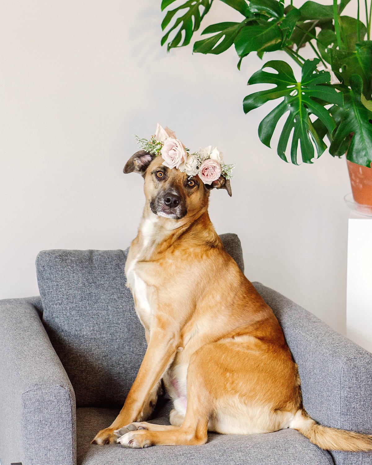
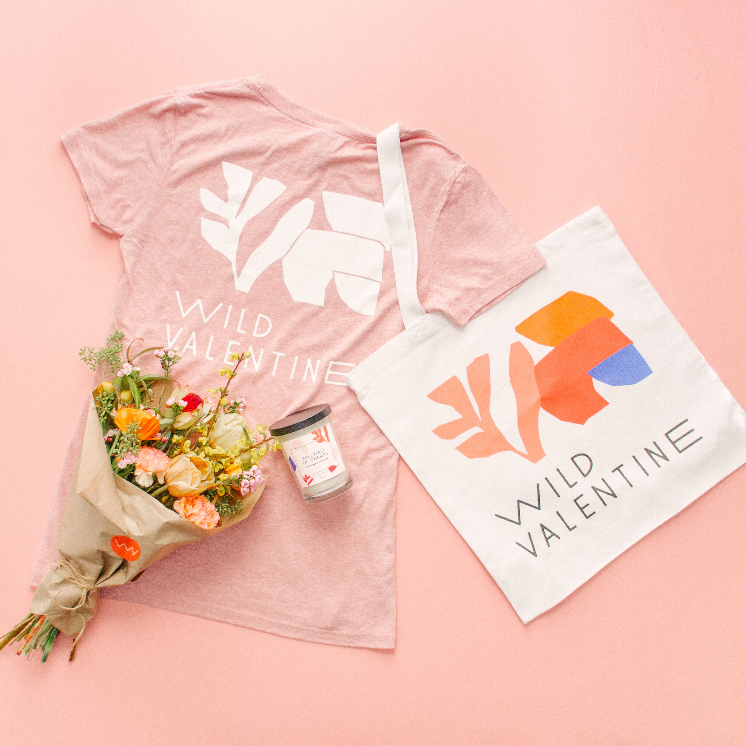
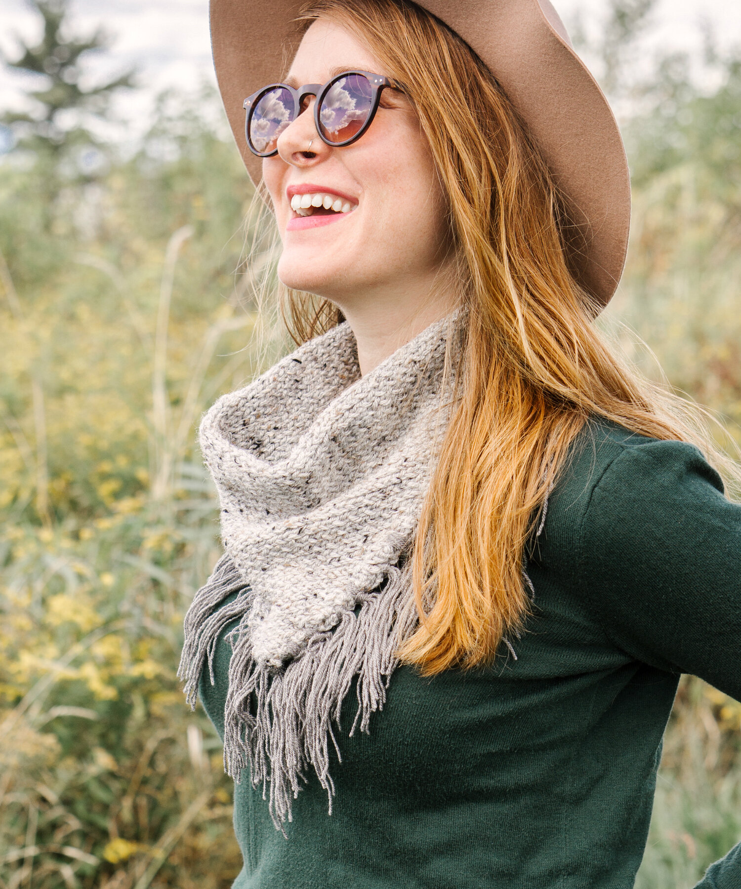
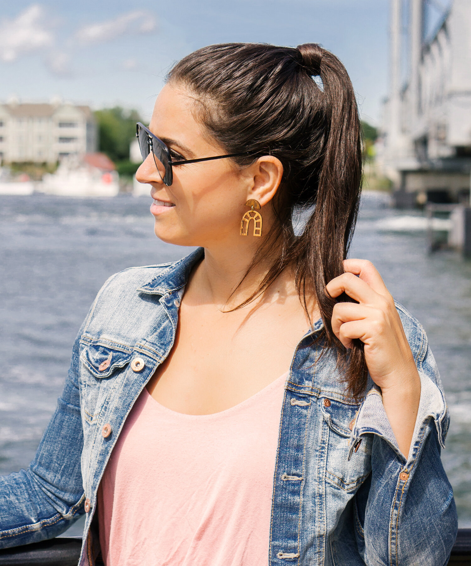
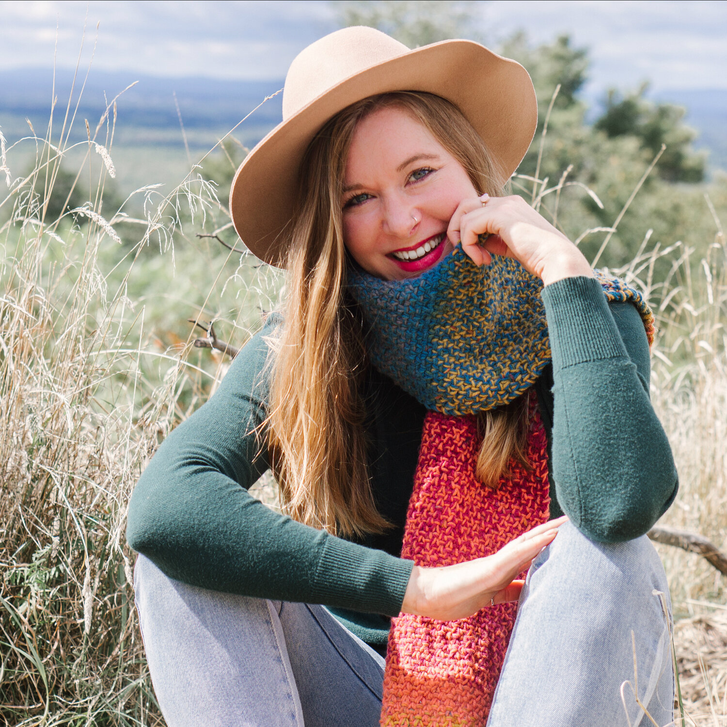
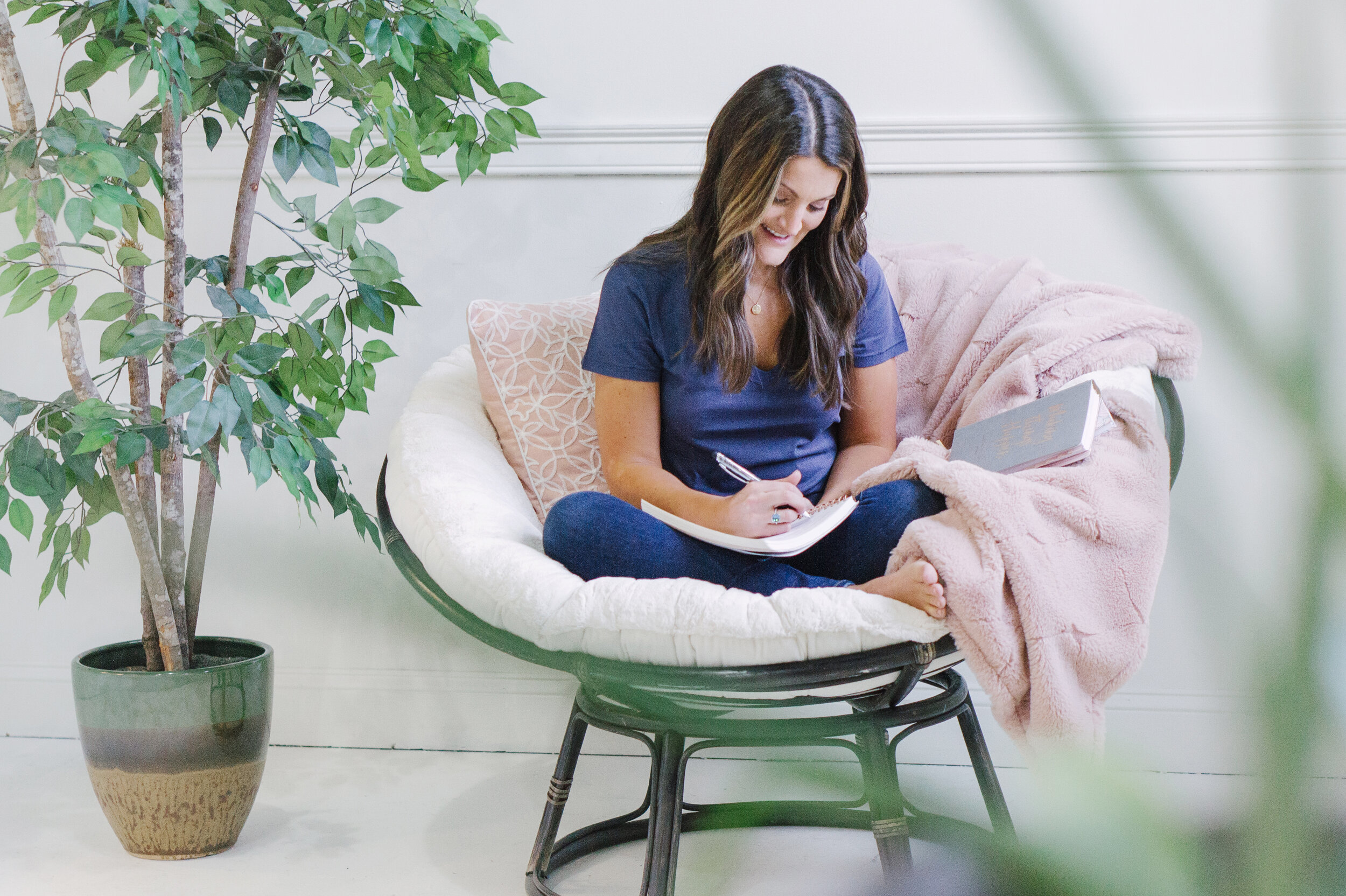
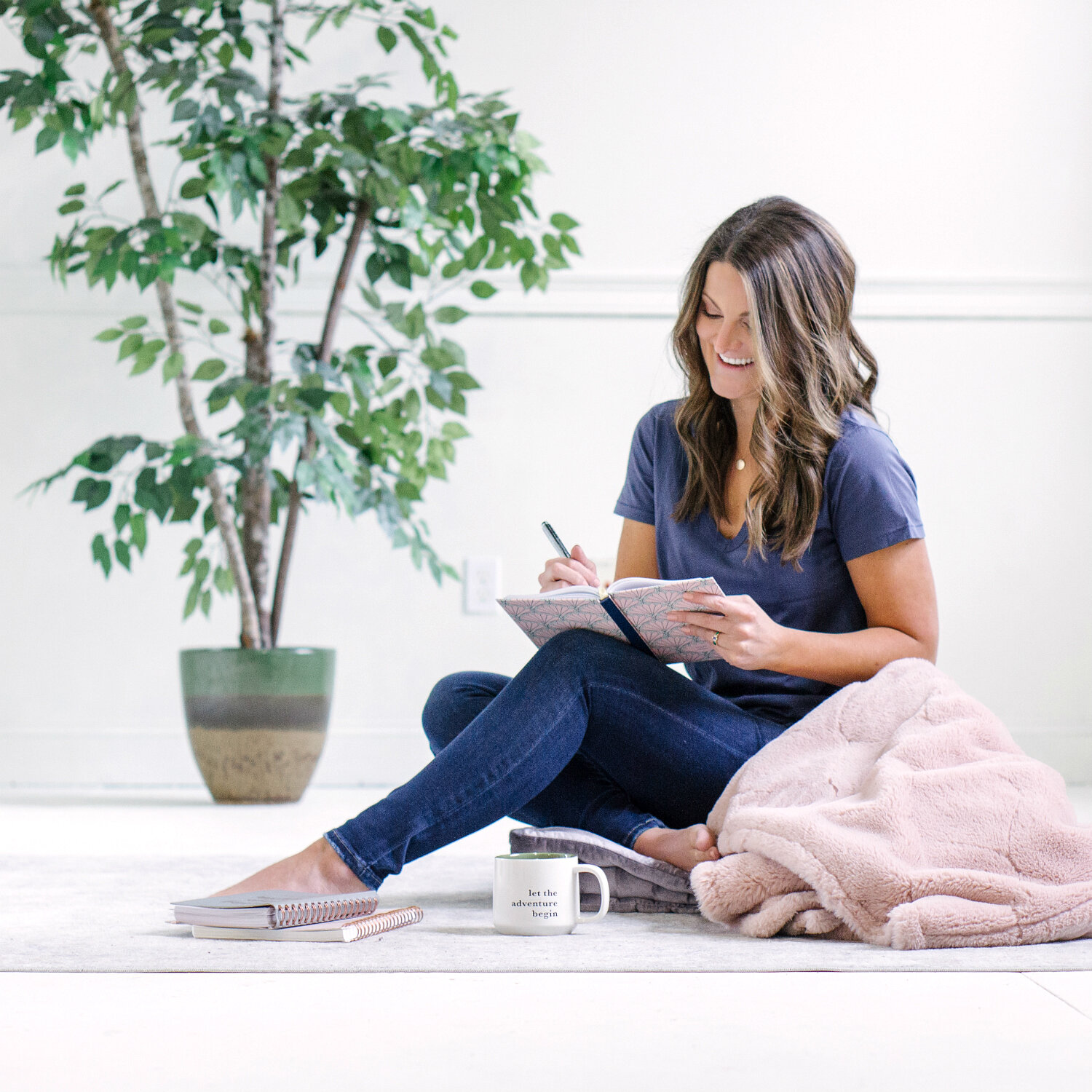
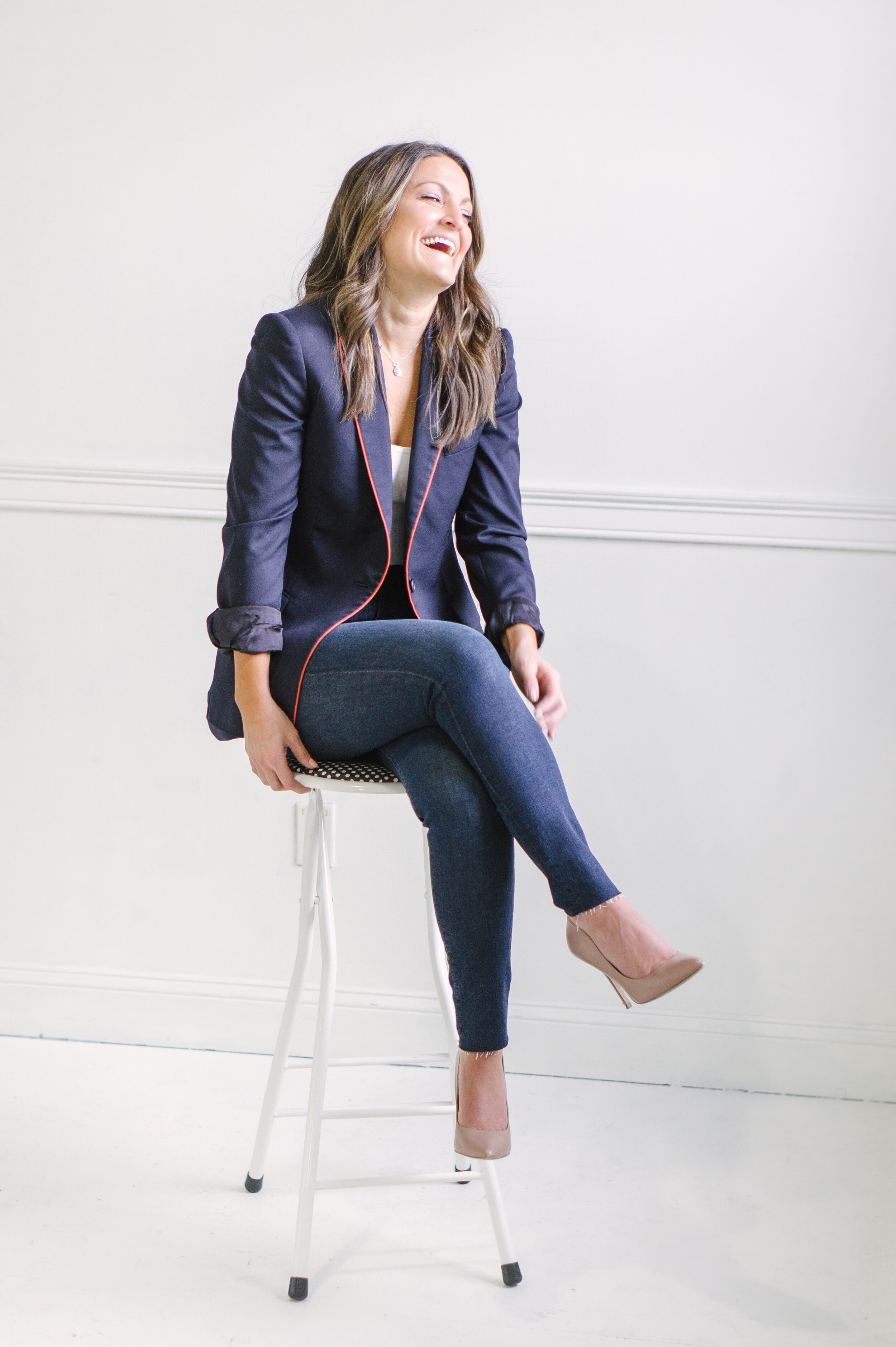
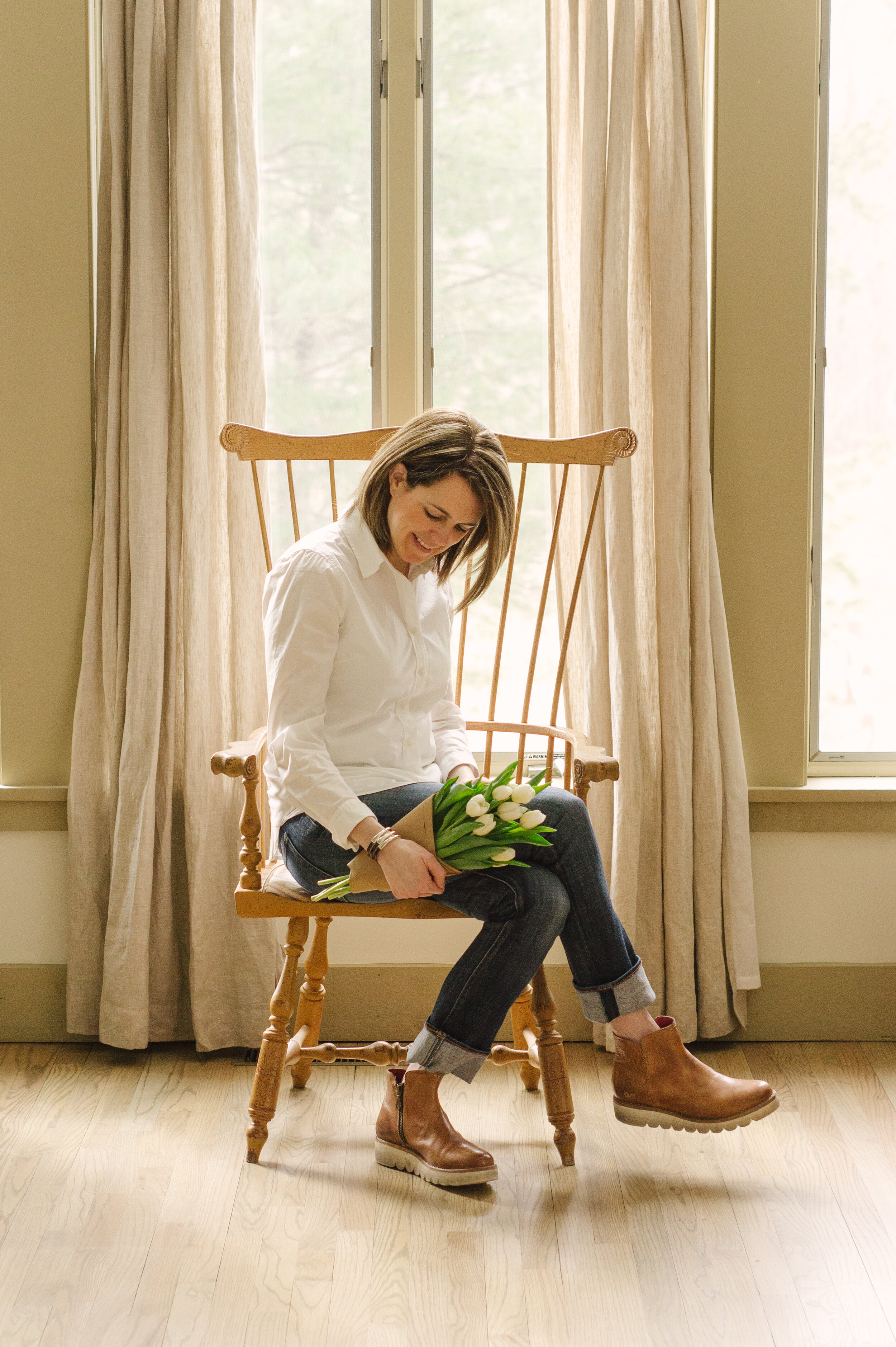
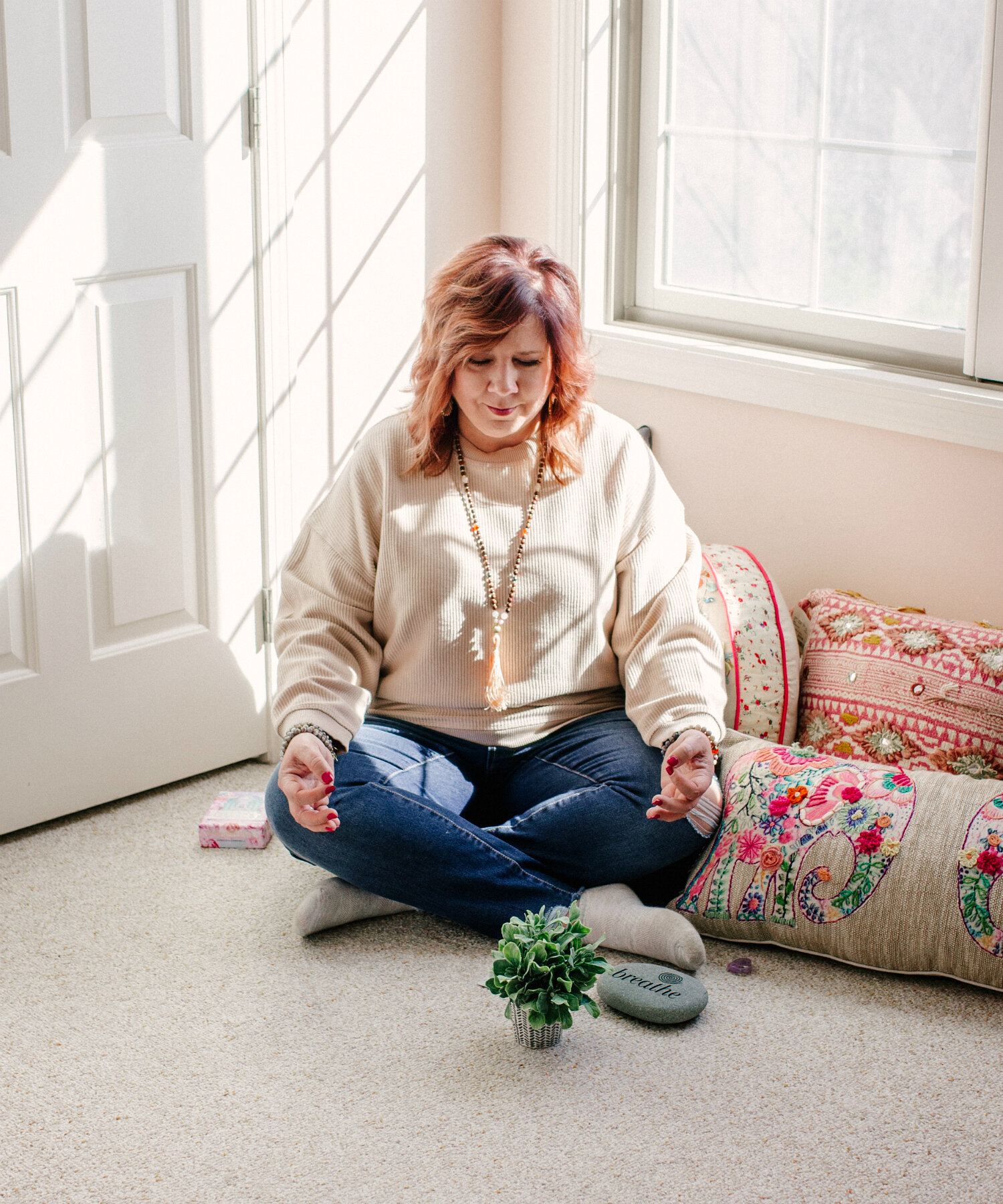
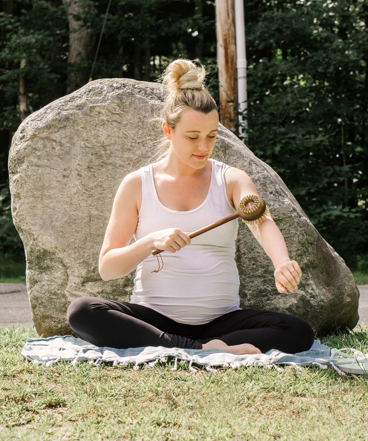
Introduction to the New Alexis The Greek Presets! Collection PREVIEW

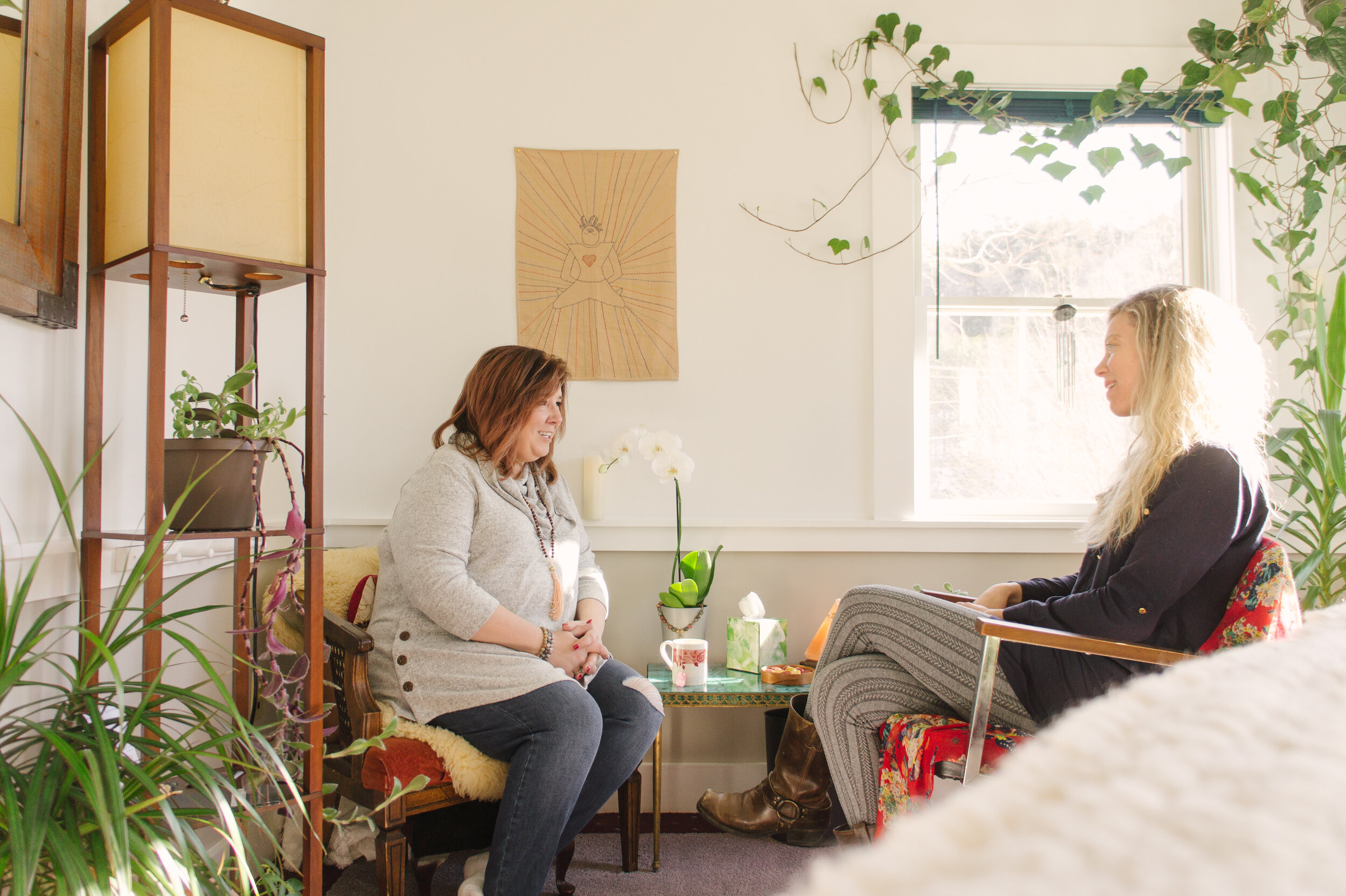
This week, I debuted my 14 NEW Lightroom Desktop presets to students of my Social Media Photography and Photo Styling (for a Living) class—and I don’t think I’ve been this excited in almost a year.
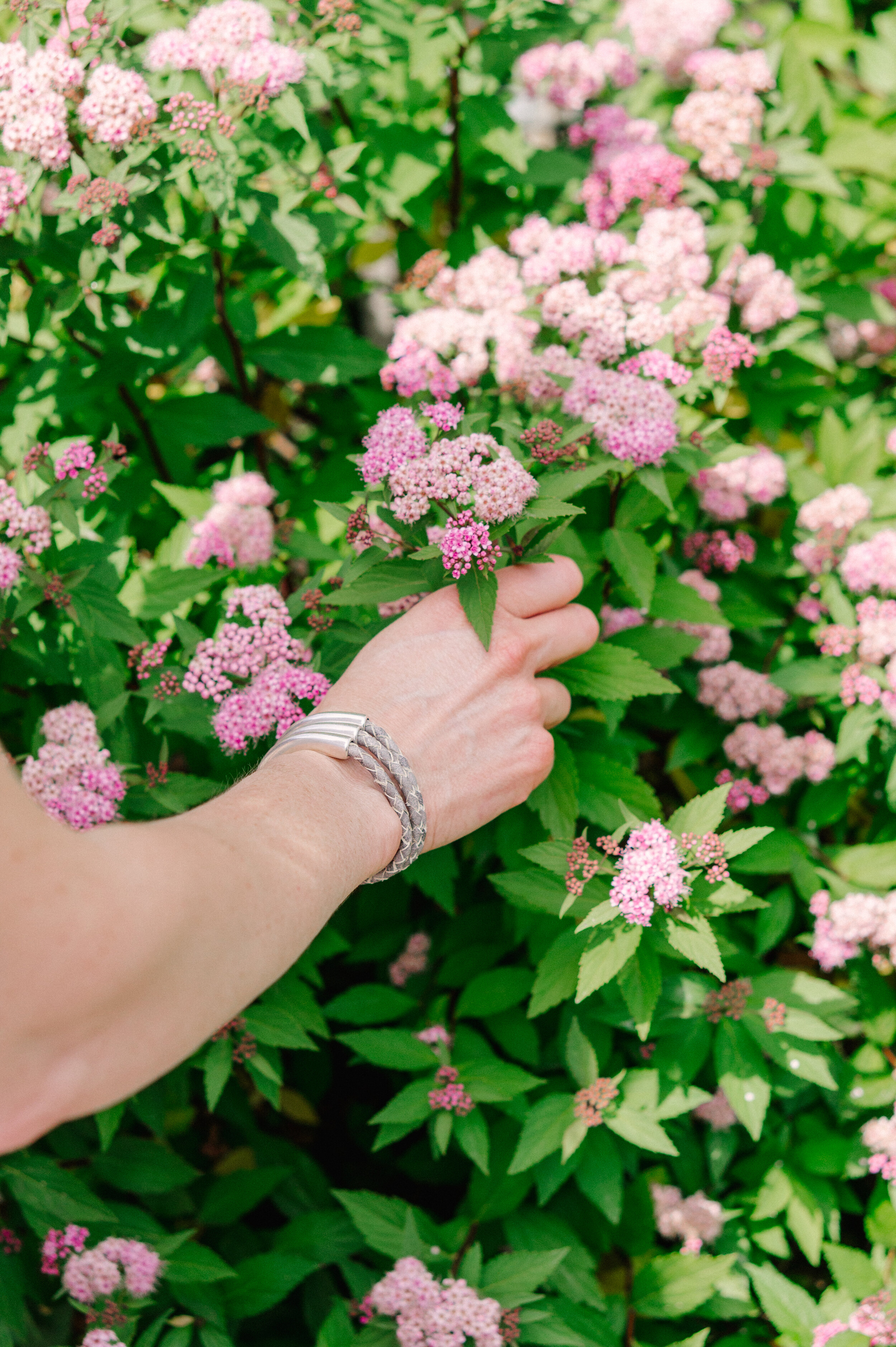
These presets were all created organically in response to the type of content I added to my roster between 2019 and 2020. I.e., as I photographed more spaces that were full of plant life, or for brands that were characterized by loads of color, or bloggers that were outdoor-adventure-y, I developed presets to fit those situations. Then I tested the different conditions for which they worked, and was pleasantly surprised by how versatile they all were!
Although they won’t be premiering to the general public for another couple weeks, I wanted to give you all a little sneak peek into a few of my favorites and how I’ve used them in different situations. Keep scrolling to the end for some great before-and-afters!
FAVORITE PRESET #1:
TARTINE
Tartine is a fantastic preset for luminous spaces and tough lighting situations (most of the time). Yellows are muted, shadows are softened, and clarity is boosted, creating a crisp and even effect that I’ve found excellent for night-life shots and a really cohesive Instagram look even if you shoot in a lot of varied situations.
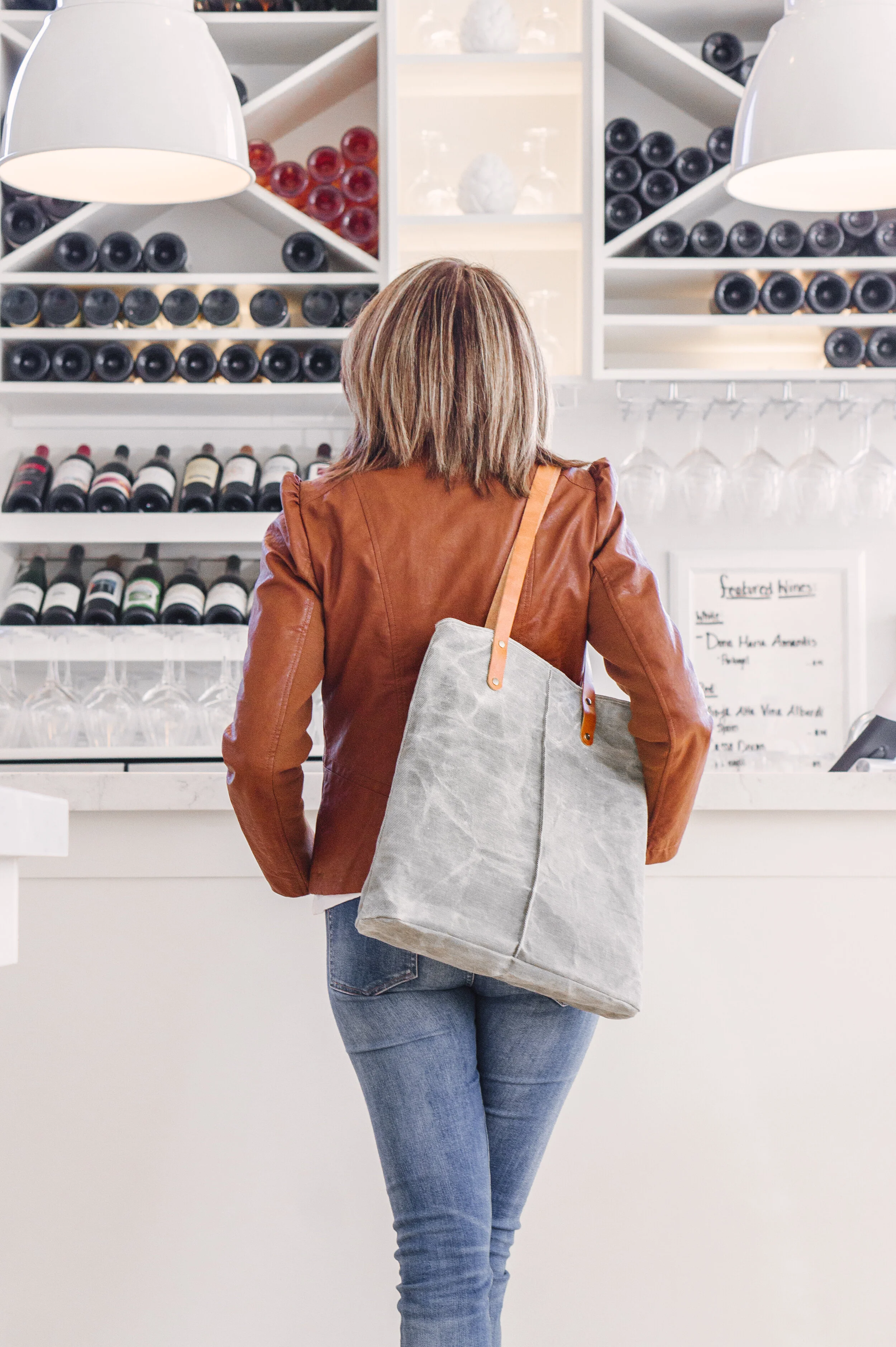
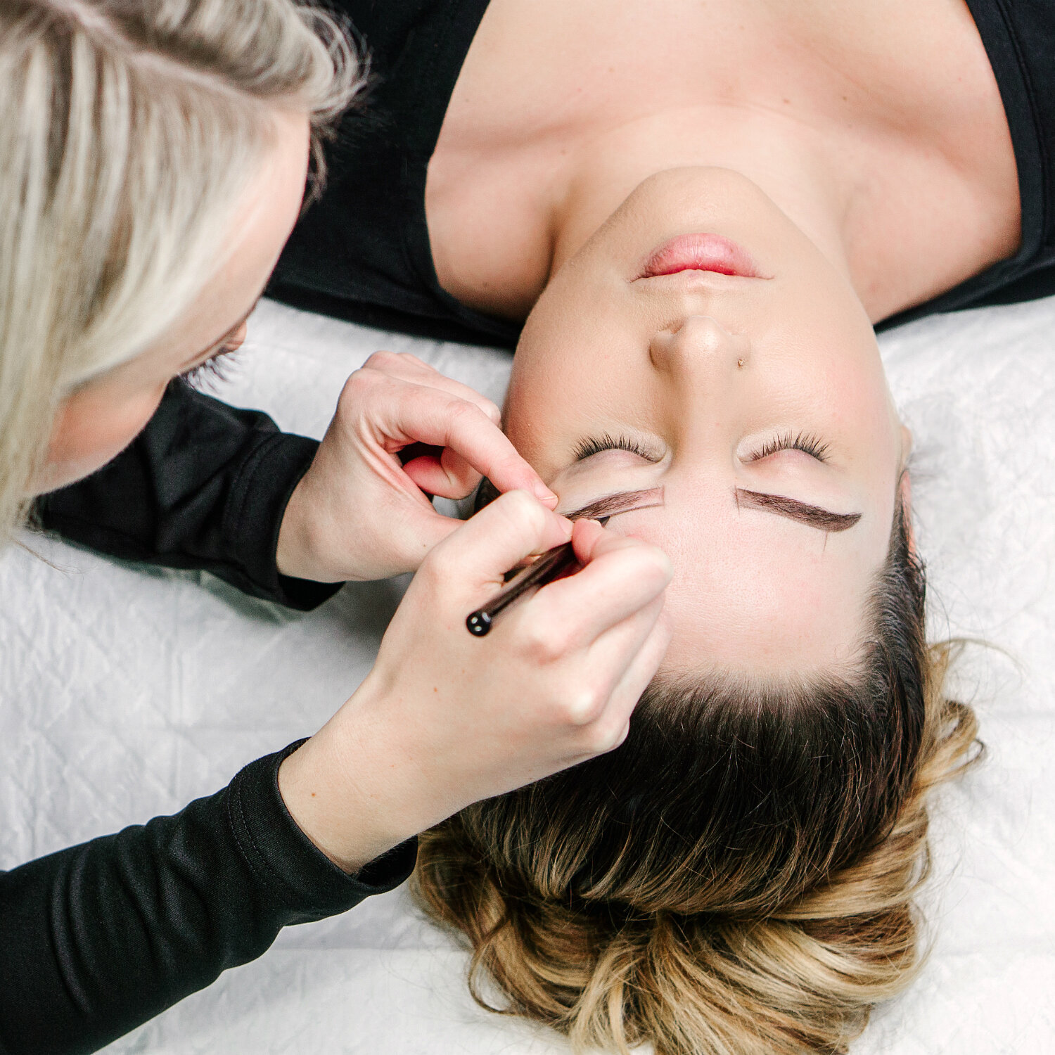
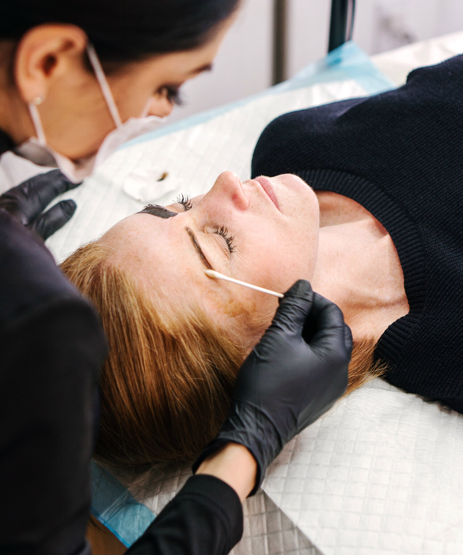
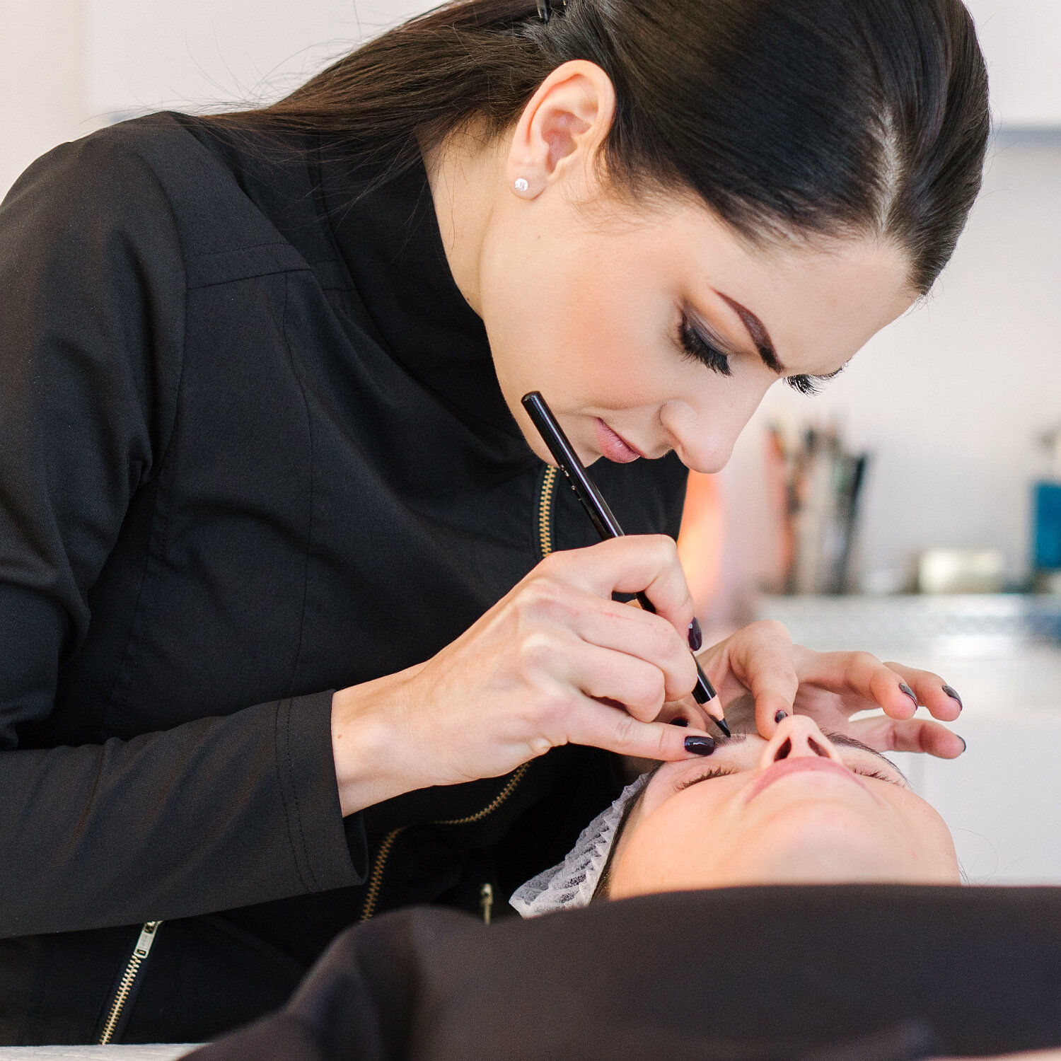
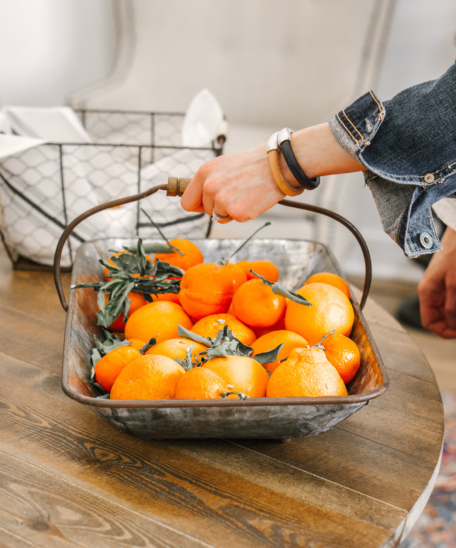
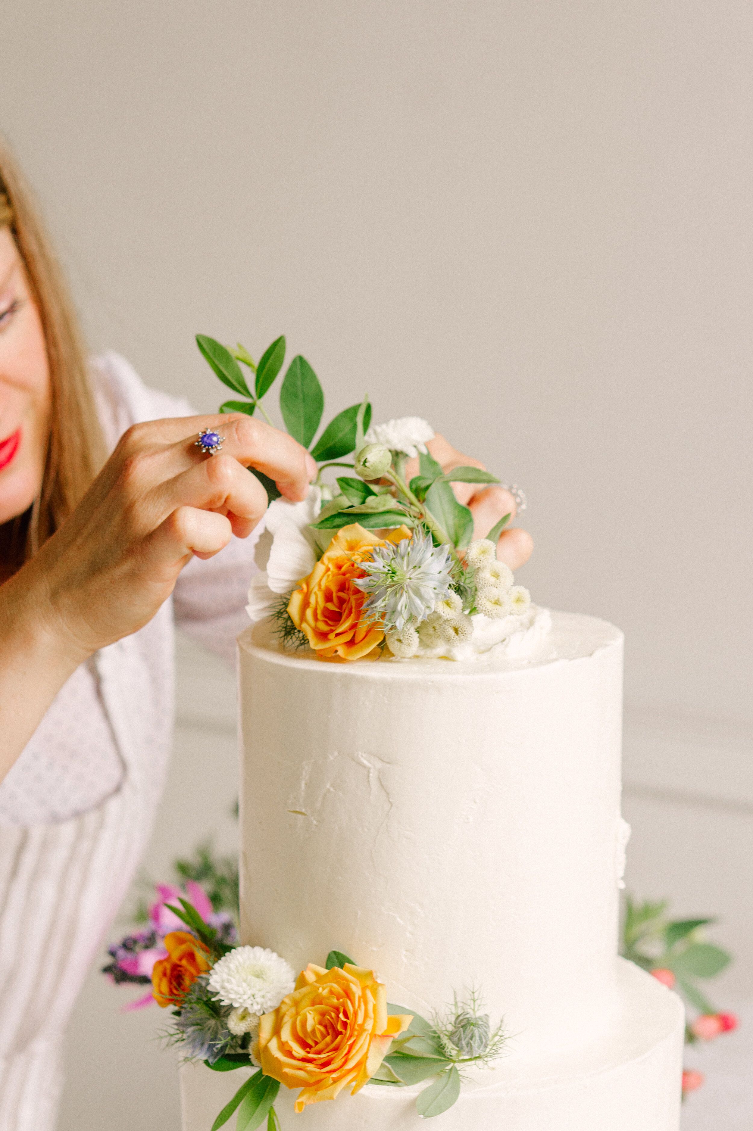
Where I’ve used it: A micro-blading studio with minimal natural light; a boutique in a historical building with windows on just one side and artificial light everywhere else; a barn venue used for weddings and dining; and a modern space with high ceilings and white walls. With one click, all the right things are brought into focus and many of the distractions fall away.
What it’s NOT for: Food. Colors you want to pop in salads and farm-to-table situations won’t show up in the hues or tones you’re hoping for. Use this preset for breweries, retail spaces, or modern art shows instead!
FAVORITE PRESET #2:
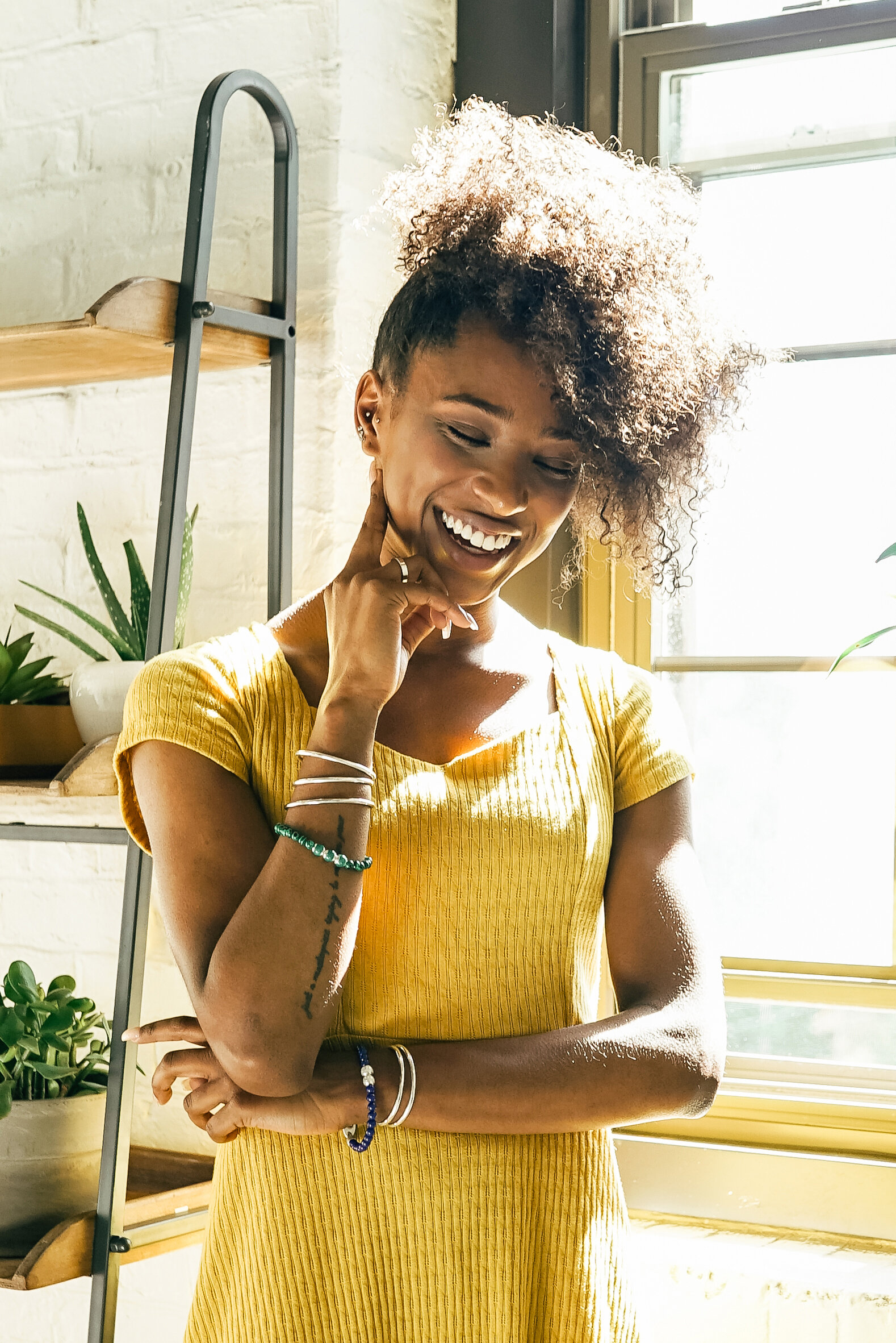
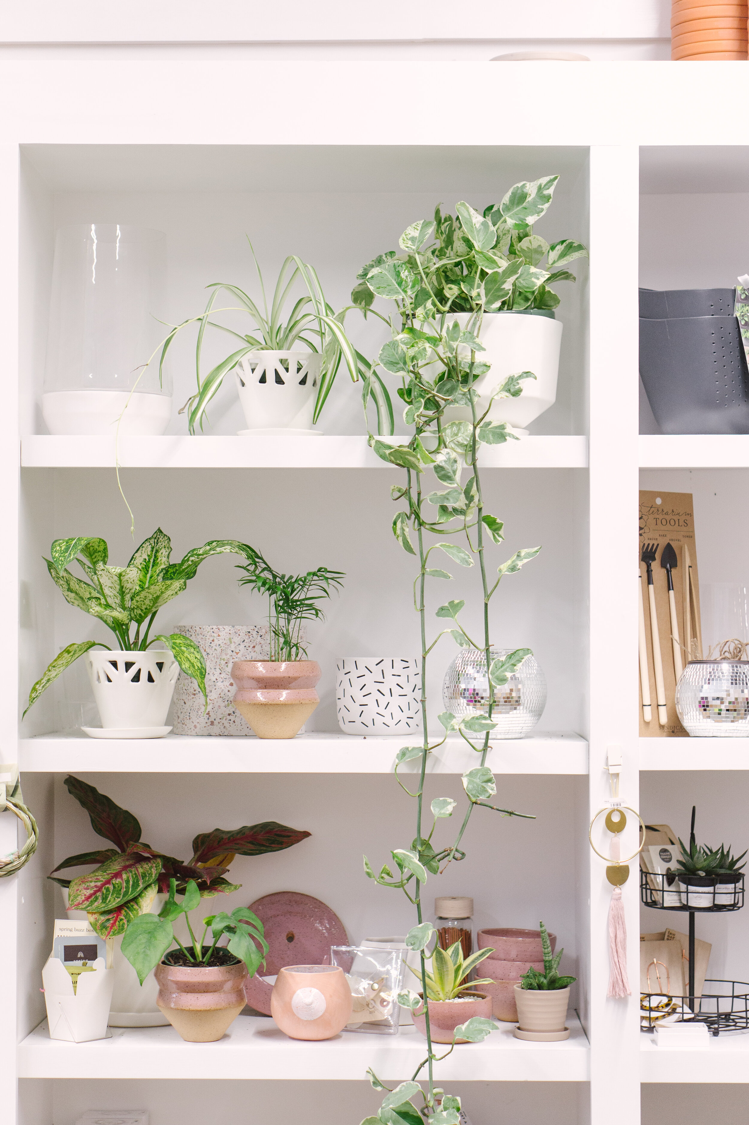
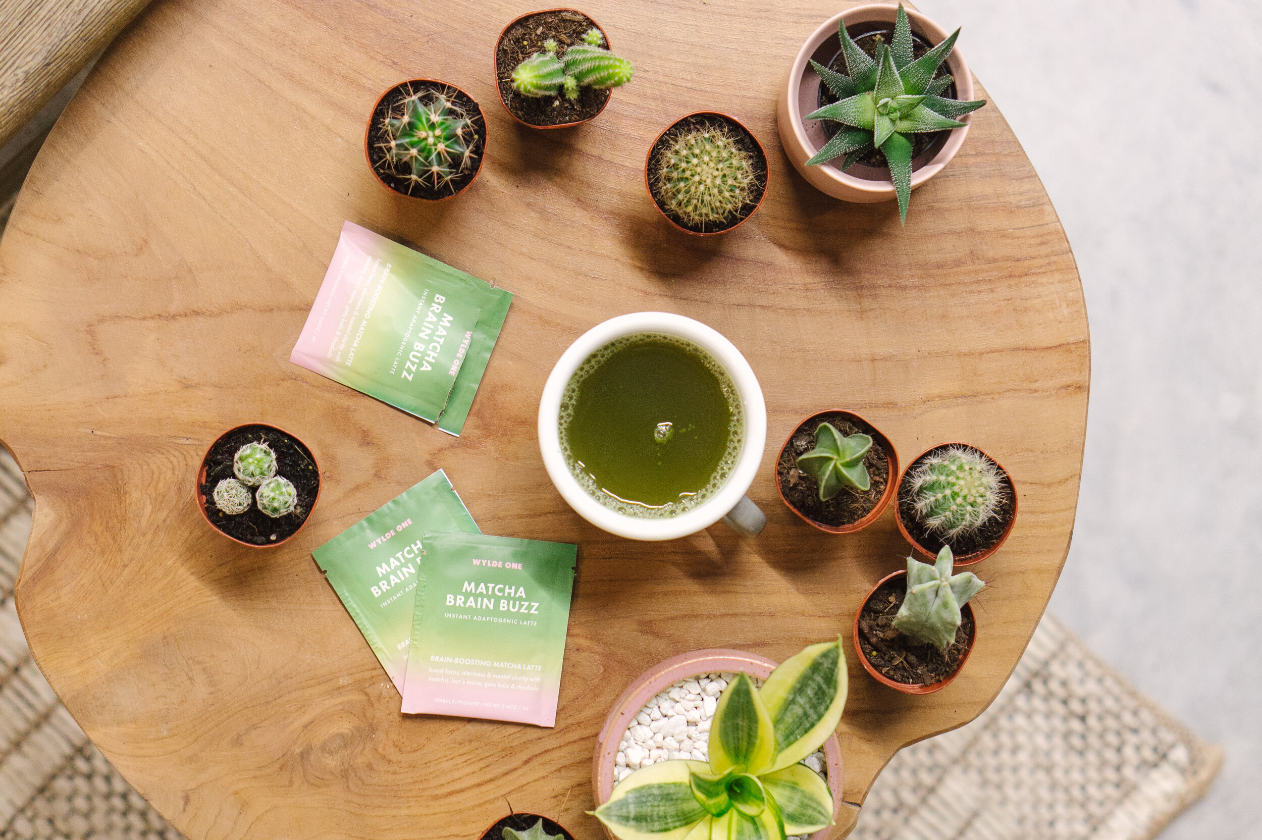
MIDCENTURY GREENHOUSE
This is my most recent creation, and honestly, I sort-of created it by accident, but I can’t believe how many different contexts I’ve been able to use it!
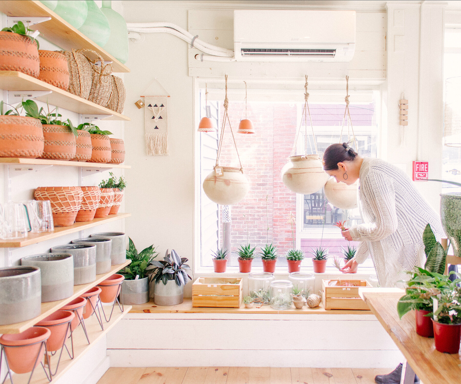
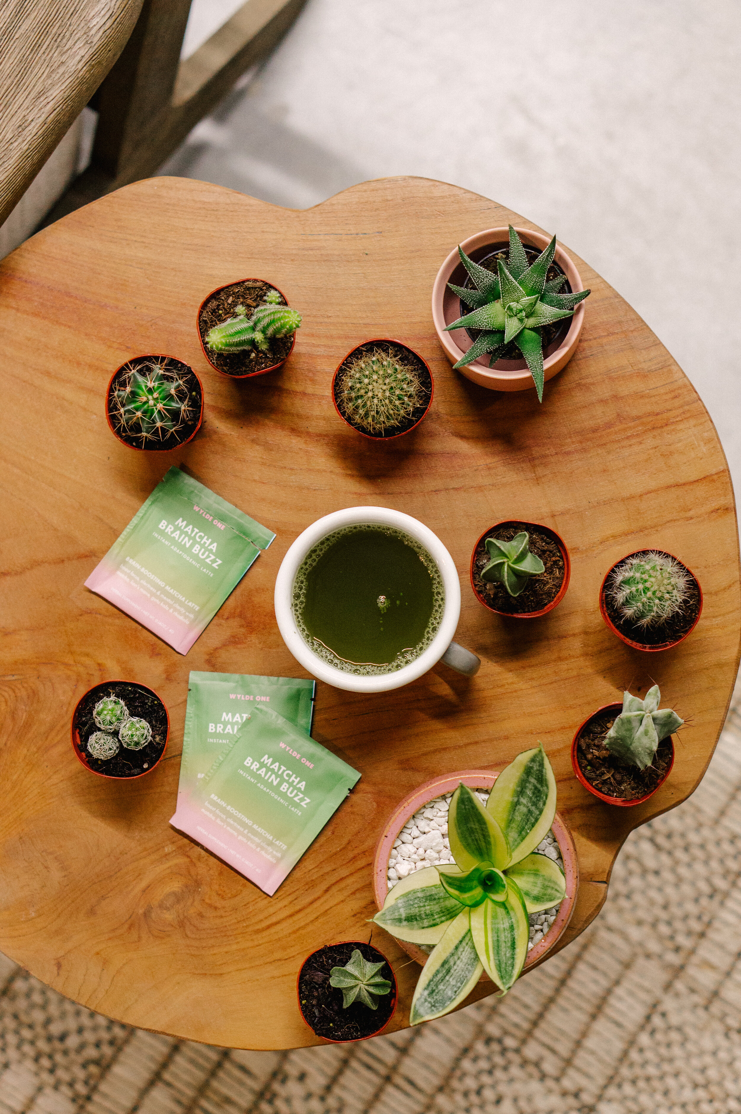

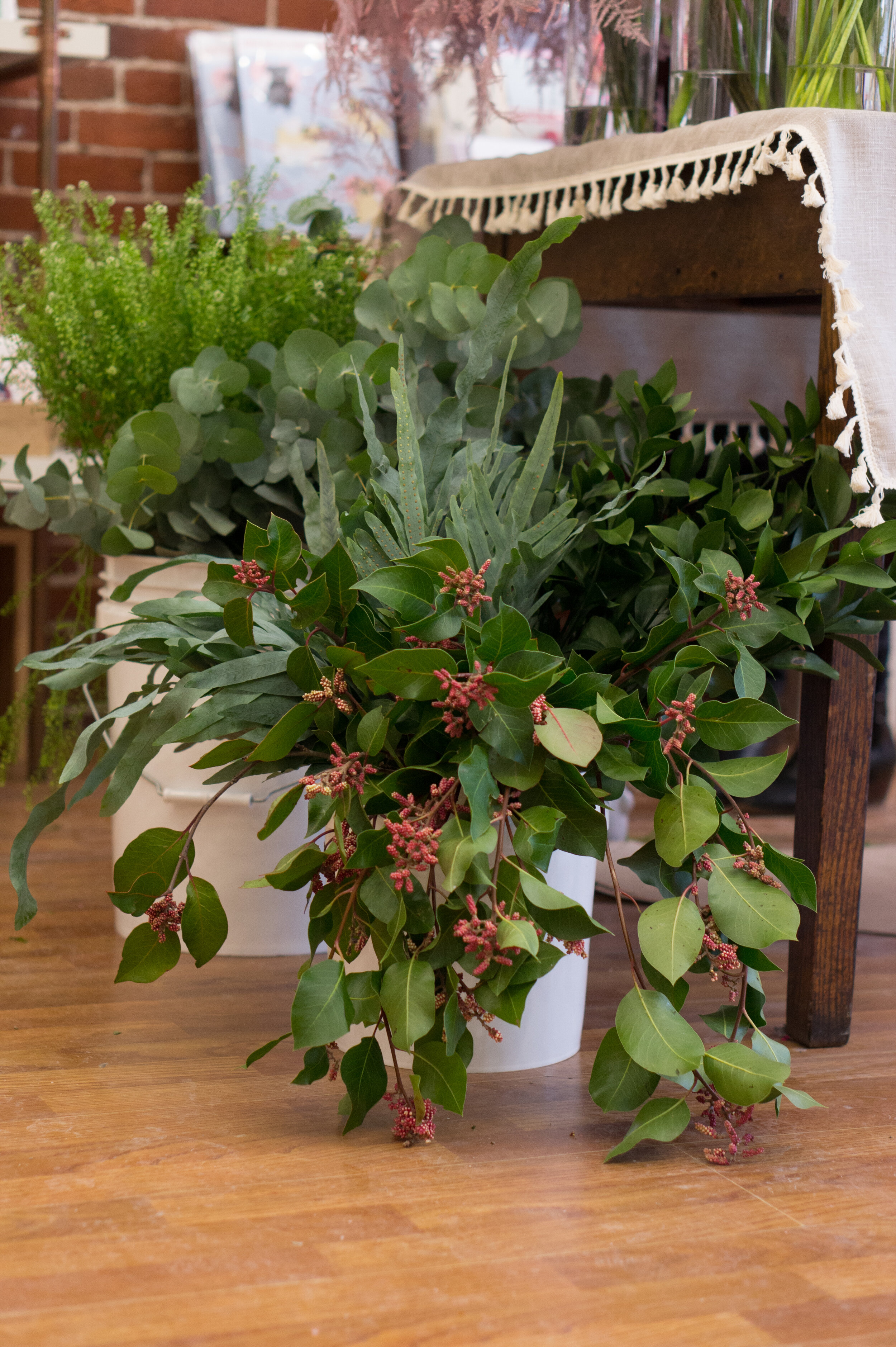
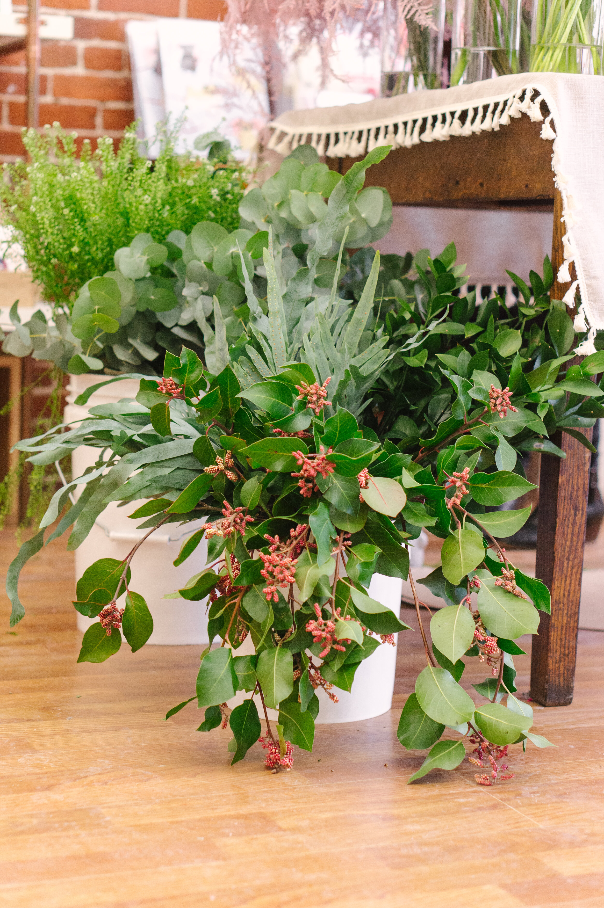
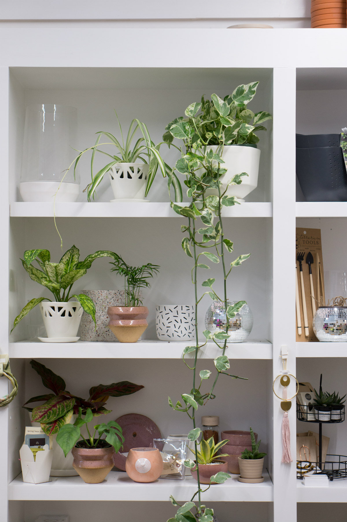
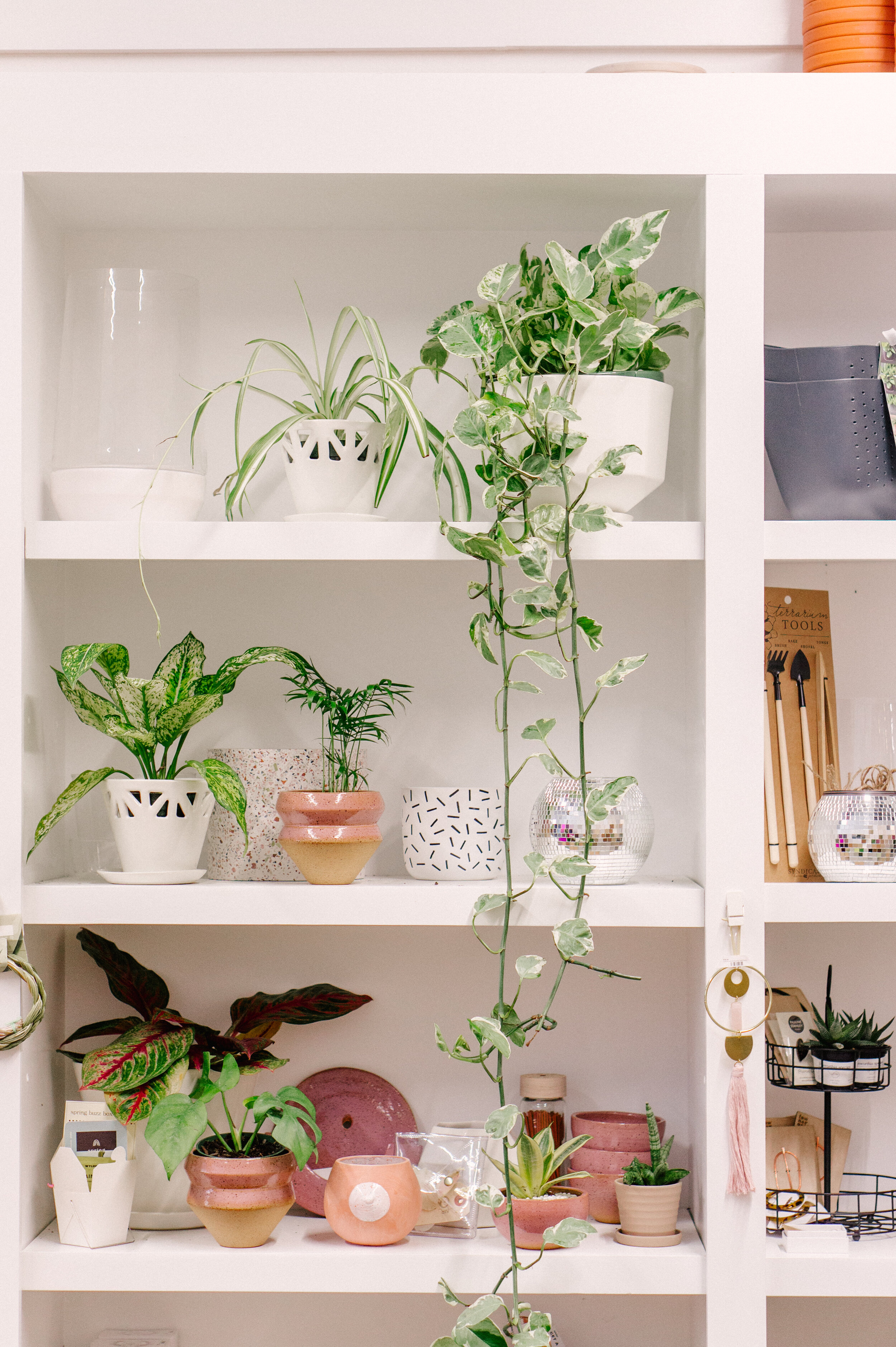
I first pulled together these settings after shooting at Oak & Moss, a plant and lifestyle boutique in Beverly, Mass. The wooden decor and natural light on two sides, plus all the terra-cotta pots and plant life, meant that many of my presets with muted oranges and greens wouldn’t be ideal. I focused my efforts on creating presets for their solarium-type side room, and I loved the look so much I saved the preset, “just in case.”
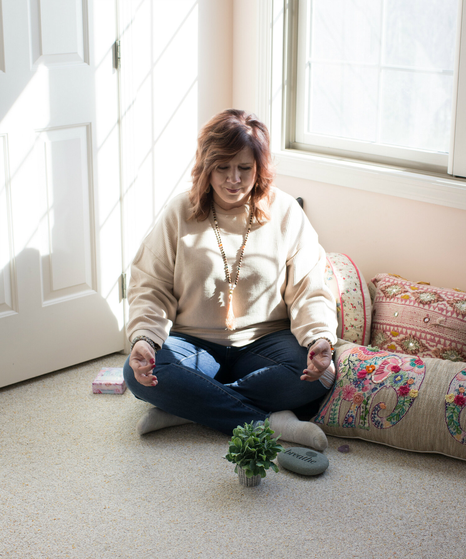
Lo and behold, every time I’ve tried the Midcentury Greenhouse preset since, I’ve loved the way it looks! I’ve used it to edit photos shot in retail spaces with fluorescent lighting, lifestyle bloggers’ homes with natural lighting, and reiki spaces—and it’s worked every time.
What it’s NOT for: This probably isn’t the first preset I’d choose for minimalist brands, or brands that focus on a mostly black-and-white look. For sure this is a preset for those who like invigorating color and a little bit of softness or femininity in their images!
FAVORITE PRESET #3:
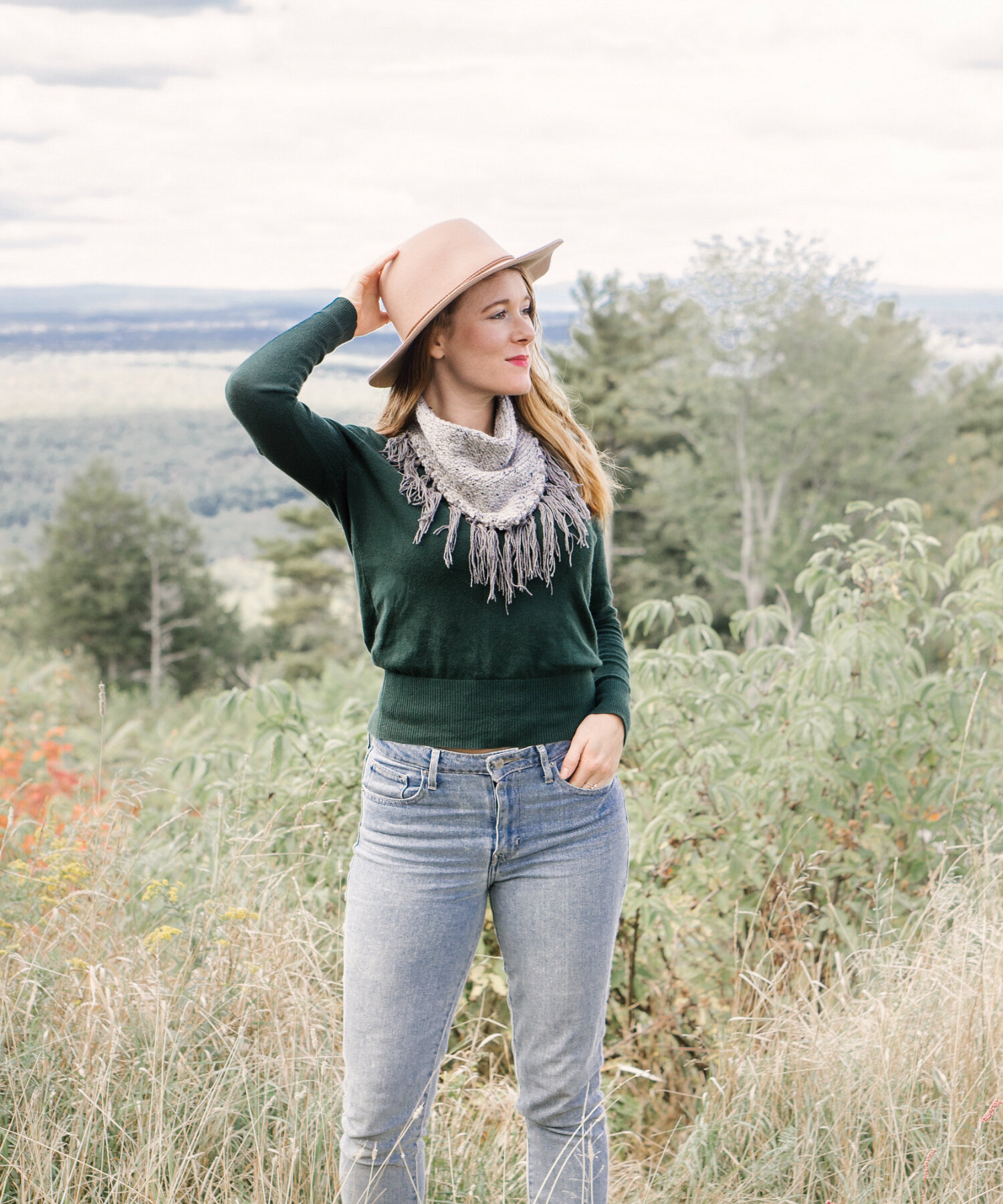
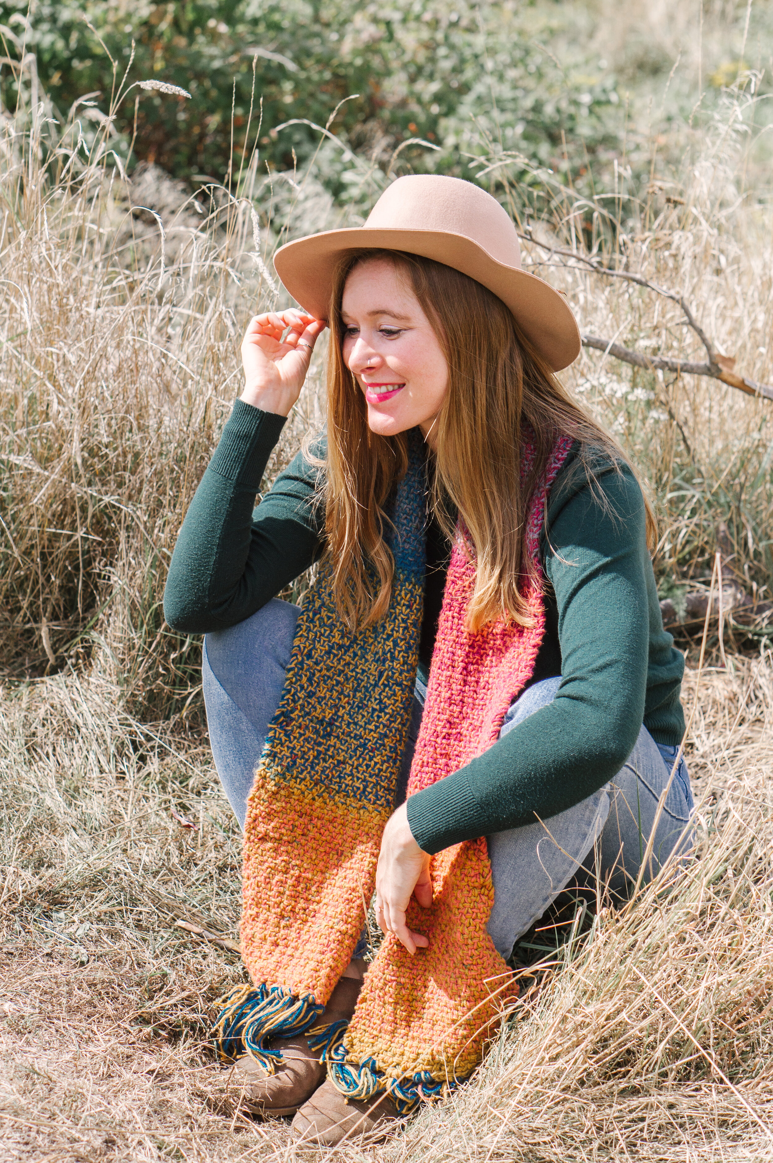
MOUNTAIN RETREAT
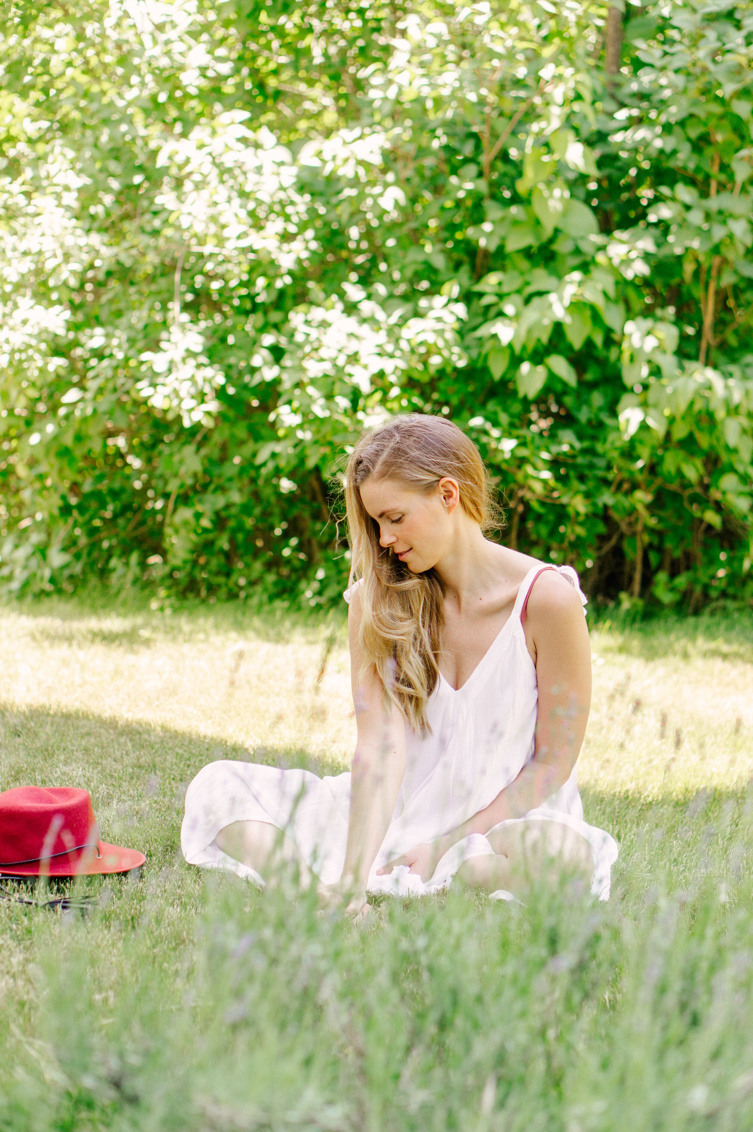
This preset is specifically designed for outdoors, but I’ve found it works really well in spaces with copious amounts of natural lighting, as well!
What makes it work outdoors: One of the hardest things to manage when shooting outside during the day is how harsh or dull the light is. I’d already created a preset with a custom white balance for shade situations (Los Angeles Summer—get it for free here), so I needed something for when light is directly overhead; a preset that would counter harsh light, yellow tint, blown-out blues and overpowering greens. This preset is just the ticket!
What it’s NOT for: This really isn’t a great preset for shooting flat-lays or indoor scenes, unless you adjust the exposure, and the luminosity of your blues, and your yellows, potentially. Oranges can also be tricky indoors… So, you’ll pretty much be creating a whole new preset if you make all the necessary adjustments—and I fortunately for you, I already did that when I created my preset Pops of Color, coming to the shop with the rest of the spring collection! Though derivative of Mountain Retreat, Pops of Color is its own experience, and I think you’ll love them both.
FAVORITE PRESET #4: STORMY MORNING
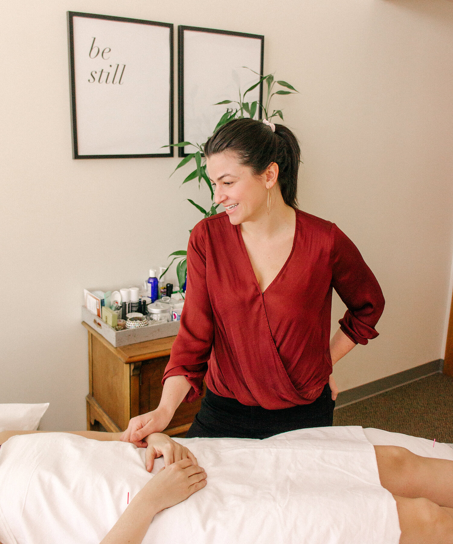
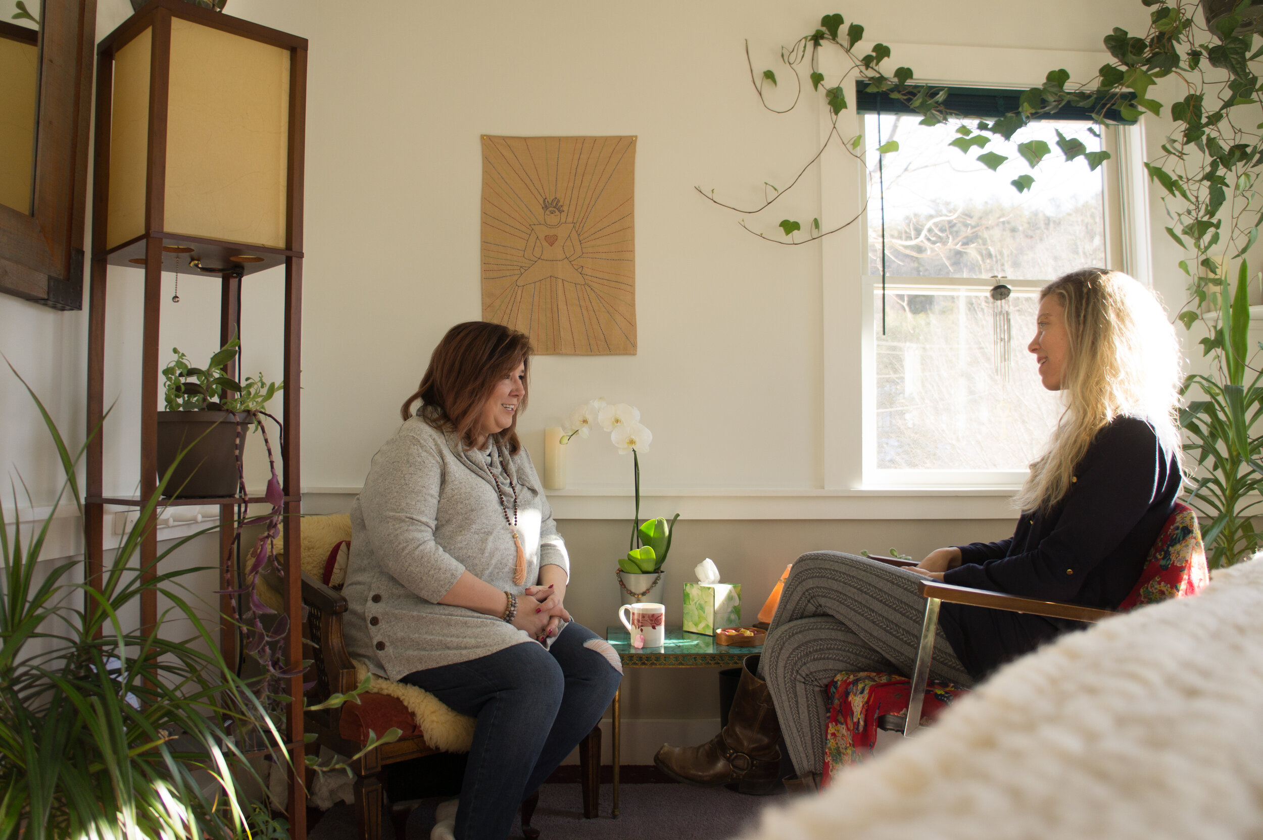
This preset was created—you guessed it—on a stormy morning, when I had planned a shoot with someone who needed to shoot in the wee hours. We were in a studio space that normally has great natural light, but between the early morning hour and the overcast skies, we were working with very limited light.
In order to give the space a more naturally luminous feel, I gave both the shadows and the highlights a colored tint—two colors which essentially cancel each other out in the final product, but together allow for the exposure not to blow out your photos and the shadows not to look too deep and gloomy.
What I’ve used it for: Portraiture, winter scenes, and overcast days of shooting. The softness of it is great for smoothing out skintone, creating a frosty feeling for snow photos, and adding light to otherwise dark images.
What it’s NOT for: Situations where you want to use high contrast to create a sense of moodiness or nostalgia. Better presets for that will be Dewy Backlight, Pops of Color (Warm), or Boys of Summer.
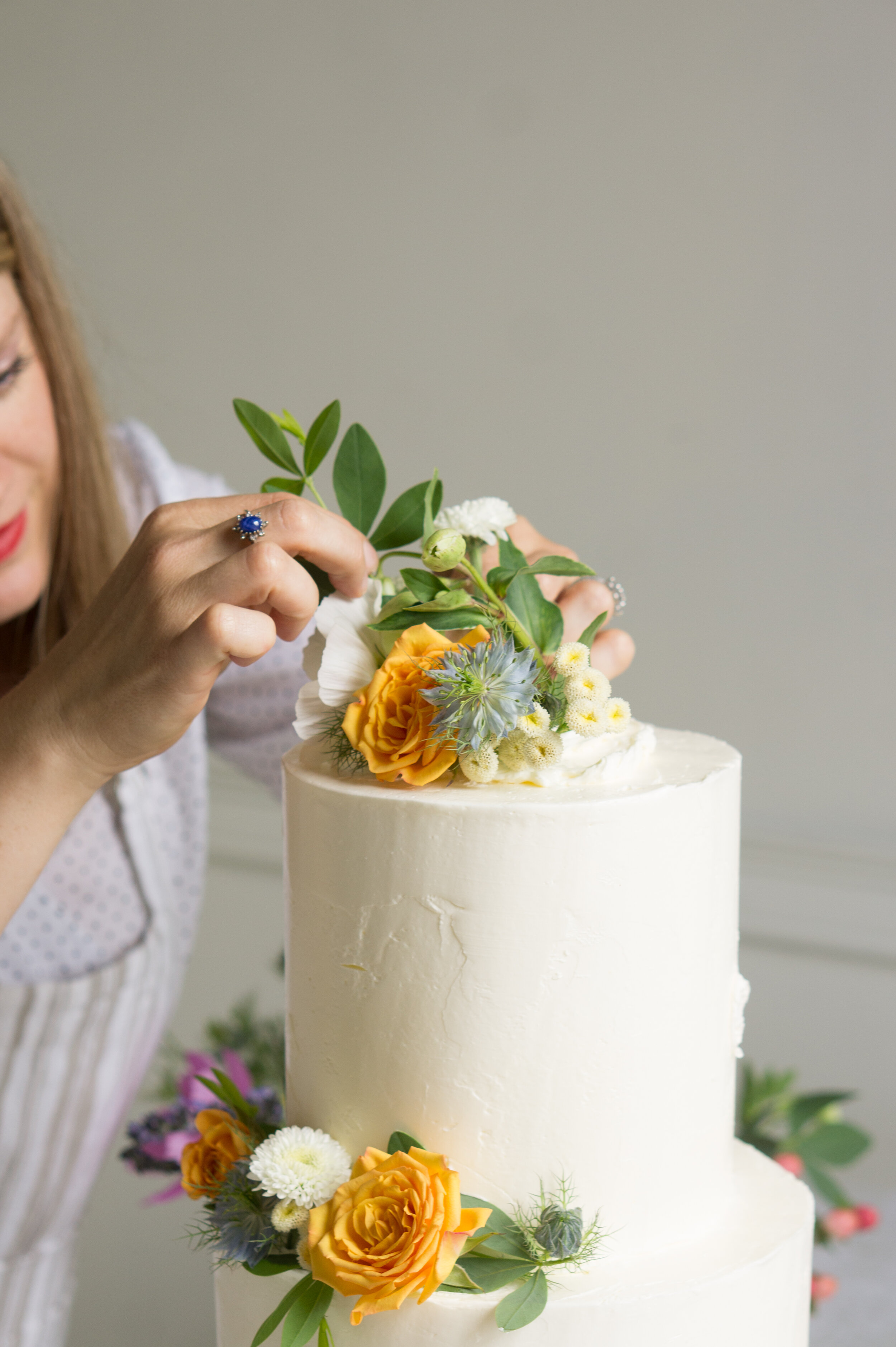
FAVORITE PRESET #5: PARIS MORNING BRIGHT
Paris Morning Bright has proved to be my most versatile preset as of late—it basically automatically “corrects” 90% of the hardest-to-avoid flaws from your in-camera photo work, such as dull contrast, under-exposure, red skin, and lens distortion.
What I’ve used it for: Portraiture, product photography that’s supposed to have a retro or nostalgic feel and still look “soft,” photos of flowers and food… It’s actually pretty hard to come up with a scenario where this preset doesn’t help in some way, shape or form!
Things to note: Like many of my presets, Paris Morning Bright has a shadow tint. If you’re uploading to a platform with the limited “web color” menu, the shadows in this preset will suddenly look very pink. To avoid this, simply drag the saturation of your “Shadow Tint” option in Lightroom back down to zero!
SEE THE TRANSFORMATIONS!
TAP THROUGH FOR BEFORE-AND-AFTERS…


— How to Access These Presets —
***UPDATED MAY 2020***
Alternatively? Join the Social Media Photography & Photo Styling (for a Living) online seminar and you’ll get the 14 presets in this Spring Collection—plus 3 others that were already inside the class—as a free bonus! No special code or any extra steps required. All you need to do to access the presets is log in to your student dashboard and you’ll see a link right at the top of the screen.
Love this post? Pin it so you never lose it! Then: Learn about how I built my subscription photography business from the ground up inside the photography-for-business class, and not only find the potential to take your photography business to the next level—get the presets today!
HELLO! MY NAME IS ALEXIS.
Coffee lover, day dreamer, foodie, and creative. I believe in doing what you can with what you have where you are. I blog to help you do more with what you have. I hope you love it here!