3 Ways to Style Your Instagram Grid for Higher Engagement

For some, the perfect magazine-level curation of an Instagram profile seems to come naturally and easily. For the rest of the world, creating even a passable profile can feel like it takes years off of life.
As someone who takes social media photos for a living, I’ve given Instagram styling a lot of thought. In fact, for every subscription client I have, I regularly play around with the images we create and try to determine how I would lay out the account for the next month if I was in the client’s shoes.
Through this process (and through analyzing countless beautiful and highly successful profiles), I’ve uncovered many ways to style an account so that it looks cohesive instead of clunky, and tells a consistent story. The more consistent the story, the easier it is to “convince” newcomers to a profile to hit that “follow” button—and that goes double if the profile looks intentional and top-notch!
I don’t have room to share every method I can think of for styling an Instagram account, but here are 3 methods you can start testing tomorrow to pull all your individual images together for a bigger picture and polished look!
A NOTE BEFORE WE BEGIN
In this post I’m going to speak often about laying out your images. This can be difficult to do without an app or software that allows you to slide images around easily; I’ve used both Planoly and the grid option in the A Color Story App. You might try the free versions of these, or give Plann a try!
METHOD #1: LAY OUT A 3X3 SQUARE WITH ONE STRONG ANCHORING IMAGE
I call this the “all roads lead to Rome” method. The idea is that you plan one eye-catching image to fall in the dead-center of 8 other images that all point back to that one eye-catching image.


In the above example where there’s a mug in the middle, the eye naturally keeps moving through the 3x3 grid and always comes back to the middle row, usually to the middle image where milk is dissolving into homemade chai tea.* Part of the anchoring nature of this image is that it’s the center image and it’s a great shot—but most of it is that all the other images “point” back to the center image:
The hands in the top center form an arrow, pointing down at the anchoring image;
On either side of the center image, Holly, the profile owner, faces her body in toward the center, causing the eye to look in the direction Holly’s body is facing;
In the center image on the bottom row, Holly’s victorious posture points upward to the center image;
Even the “supporting” corner images that don’t point directly to the centered anchoring image at least point to images that point to the center image!
If you plan your Instagram profile ahead of time in increments of 9 (or 3x3 grids), you can always plan which image will land in the center, and arrange the other “players” to support that image by pointing to it.
(*In this particular grid, the image where Holly is making eye-contact with the camera is also a perfectly natural place to settle.)
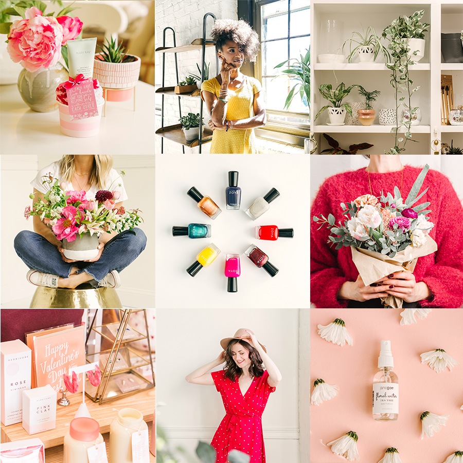
METHOD #2: ALTERNATE BETWEEN “LIGHT” AND “DARK” IMAGES
This method is actually very common, and is often referred to as the “checkerboard” method. The premise is to alternate every other image in some way—such as alternating between quote graphics and actual photos, or bright images and deeper ones.

The issue with this method is that often, what results from the well-intentioned attempt to simplify and streamline Instagram curation is actually a clunky or harsh profile aesthetic—something that looks intentional for sure, but hardly elegant or easy.
Luckily, combatting this problem is pretty simple! The quickest way is to close the gap between the “light” and “dark” images—to not keep them completely disparate.
In the above example, the untrained eye would look at the images laid out and see no pattern, apart from the continuity of flowers. However, to the social media pro, it’s easy to see a general flow of dark-light-dark-light.
It’s not a perfect alternation; the last two images at the bottom are theoretically reversed of what they ought to be in the sequence, but it’s almost impossible to tell because what’s considered “light” and what’s considered “dark” actually aren’t that far apart. Between the subtle alternation and the cohesive color scheme, this profile would certainly make anyone want to hit the “follow” button!
METHOD #3: MIX UP YOUR FOCAL DISTANCE WITH EVERY IMAGE
This final method is one I call “such a tease,” and that’s because the idea is to pull your viewer in close so you can flirt a little, and then pull away again so they can chase you—

—meaning, in this method you mix up often whether you post an up-close detail shot or a photo far enough back from the subject to show it in full context.
In the above grid, we see some images shot at quite a distance, such that we can see the accessory designer, Lindsay, from head to toe. In other images, we get up-close and personal details on her handmade clutches and wristlets. And in between those images are “median” images that are neither one or the other.
This method doesn’t follow a perfect formula, but in many ways it doesn’t have to. When we post too many images in a row that are up-close, a profile can feel distorted, vague, un-engaging; and when we post too many “far off” images, it can be hard to tell at first glance exactly what story a profile is trying to tell. By providing both, a balance is almost instantly achieved.
As you get better at curating your account using one of these methods, you discover that you can layer it with other methods. If you look at all three methods and the three styled grids shown here, you’ll see that each of them leverages more than one method to some degree:
On Lindsay’s grid, we see an anchoring image of 5 wristlets in a row, and all surrounding images point in its direction;
In Holly’s grid, we see an alternation of images that are white and images that are blue (light and dark);
In Wild Valentine’s grid, we see a variety of focal distances.
So don’t pick one method and worry you might have picked the wrong one, because they aren’t mutually exclusive! Start with one method, get the hang of it, and then add on another—before you know it, you’ll have a profile you want to visit 10 times a day just because you’re so proud of it!
Was this helpful? If so, pin the post so you never lose it! And if you want inspiration to see how these methods are being used on real accounts, check out these profiles and see if you catch match their content to the method: Starfish Project, Smile and Wave, Janae Hardy, Amelia Edmondson, Causebox, East Olivia, Stef Heitz.

HELLO! MY NAME IS ALEXIS.
Coffee lover, day dreamer, foodie, and creative. I believe in doing what you can with what you have where you are. I blog to help you do more with what you have. I hope you love it here!