5 Steps to Hone Your Photo Editing Style for Your Social Media Brand

There’s nothing like loading an image you love to your social accounts, only to discover it sticks out like a black sheep among the rest of your content.
This used to happen to me so often it made me hesitant to post at all. (This was back before Planoly and Plann hit the scene, and Photoshopping a grid together took more time than I had on my hands.) Over the last couple years, I’ve experienced the problem less and less as I’ve honed my social media editing style.
If you’re struggling with your social images looking clunky together, try following these five steps—in order—and see if your feed doesn’t magically start looking 10X better!
You might also enjoy: 3 Ways to Style Your Instagram Grid
1 - CHOOSE YOUR STORY.

Your story is the narrow range of topics and subject matter you’re willing to post on your social channels.
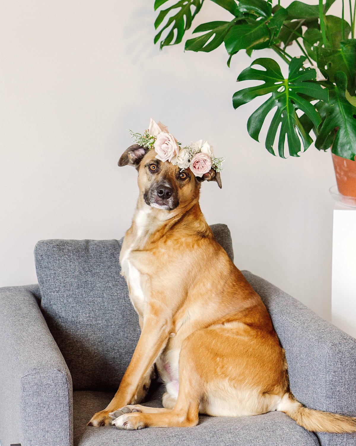
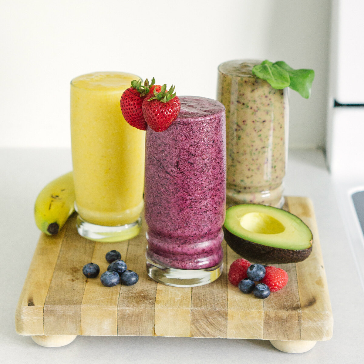
It’s possible that throughout your daily adventures, in work and in life, you take photos of everything ranging from beautiful storefronts to food to products that just came in the mail—but that doesn’t mean you need to post all of it!
If you want the “Photos” tab on your Facebook or your grid on Instagram to look cohesive, you want the story to be clear—and that means eliminating anything you shoot that isn’t relevant to why anyone would want to follow you—a.k.a, your story.
The story on my social channels could be summed up “girlbosses,” or “women who are making it happen.” This means no matter how tempting, I don’t share food photography on my grid, or happy moments that come up throughout my day. If I do want to share any of that, I do it on my Instagram stories or personal Facebook account, where the vibe is more casual and less permanent.
Pick what your story is—the reason the most people will want to follow you—and post only what fits that story.
2 - PICK A SPOT ON THE LIGHTING SPECTRUM.

Light is key to a consistent editing style.
Visit any of your favorite social media accounts and you’ll see that each has its own clear place on the light spectrum that ranges from “light and airy” to “dark and mysterious.”
Photo collections that hop around on the lighting spectrum tend to look eclectic, disorganized, maybe as though the photos are not all taken by the same photographer… They can even appear not to tell a consistent story because the exact same subject can look entirely different in different light.
It can be hard to commit to one lighting style, since we’re all complex beings with a wide range of moods and emotions and things we want to say; however, if you want a consistent social aesthetic, it’s imperative to decide what light supports the story you’re trying to tell, and to stick to that!
I’ve settled on a place on the lighting spectrum that is more light and airy because I think it reflects where my clients are in their personal journeys—they’ve overcome a lot of self-worth stuff, pursued their dreams, and are living the best versions of their lives to date, so they’re happy and full of light themselves.
What light best supports your story?
3 - SELECT YOUR TEMPERATURE AND TINT.

Warm with green tint

Cool with purple tint
Temperature (how warm or cool your photos are) and tint (how raw or romantic) are two of the most powerful ways to take your social media aesthetic from “amateur” to “pro” in just a handful of posts!
Temperature has to do with which tones you draw out of a photo—the orangey nature of reds and yellows, for instance, or the blue-ish nature of your purples and greens. Warmer photos tend to evoke a sense of adventure, while cool photos tend to evoke a sense of calm or introspection.
Tint has to do with the subtle color of your highlights and shadows—usually either a greenish color (I think of this as looking “raw”) or a purple-ish pink (I think of this as looking “romantic”). Green-tinted photos are great for stirring authentic conversations, while purple-tinted photos tend to me great for stirring the imagination.
Most photo editing apps will give you the option to adjust your temperature, and the really good ones will allow you to edit your tint. You can adjust both inside Adobe Lightroom (paid on desktop, free on mobile).
Think again here about the story you want to tell—do you want to incite action and discussion? Then you might try warm edits with green tints. Do you prefer to give people something to think about? You might try cool edits with purple tints!
To see how I use temperature and tint, you can visit my presets on my Resources for Photography page!
4 - FIND THE EDITING APP THAT BEST FITS YOUR NEEDS.

I love the A Color Story app for editing my images before I publish them on Instagram.
Most of my “big edits” happen in Lightroom or Photoshop before I’m ready to debut my photos to the world (the before-after above was edited using my signature presets in Lightroom); but as I explain in a tutorial you can get here (pop in your email to snag it!), once you load your images to anywhere on the internet, they lose some of their pomp. So I make a few last-minute edits to my photos after I’ve downloaded them to be phone, but before I upload them to Instagram.
What I love about A Color Story: I have both filters and manual editing control; my manual edits can include temperature edits, tint edits, exposure and sharpening; and the app comes with a free grid for planning out content (see below).
That said, my needs might not be the same as yours! Find the app that works for you. Some others you might want to search include VSCO, Google’s SnapSeed, Ribbet, or Picnic.
5 - MAP YOUR GRID AHEAD OF TIME.

Mapping your Instagram grid ahead of time has many benefits, but one of the best ones is that once you create a grid you love, you can analyze it to see what you love about it.
Do you love images that have a little plant life in them? Pops of color? Do you always choose photos with deep shadows, or golden-hour halos of light? Do your best images feel warm, or cool?
In the grid above, the images could be characterized as light and airy, cool and fresh, with pops of warm colors. Future photos can be planned around these stylistic preferences, as well as edited in one of the apps listed in step #4 to “bring out” these characteristics. BONUS: I actually wrote another post about mapping your Instagram grid for maximum impact, which you can read here!
Was this helpful? If so, pin the post so you never lose it! Then scroll on down and hit the “share” button below so your entrepreneurial Facebook friends don’t miss out, either!

HELLO! MY NAME IS ALEXIS.
Coffee lover, day dreamer, foodie, and creative. I believe in doing what you can with what you have where you are. I blog to help you do more with what you have. I hope you love it here!